Picture spending $700 million to reintroduce yourself...only to backtrack a week later.
That's exactly where Cracker Barrel ended up this month.
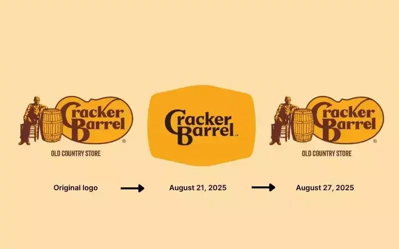
They rolled out a new logo, ditching the old man and barrel, and the internet absolutely torched them. By week's end, their stock dropped double digits, political commentators jumped in, and the brand quietly said: actually, never mind, we're keeping the original.
This isn't just about pancakes and rocking chairs. It's what happens when brands forget their soul.
What Went Down
Cracker Barrel's new CEO has been pushing a 3-year, $700M modernization plan. Think brighter restaurants, fewer antiques, updated menu, sleeker interiors.
The new logo was supposed to cap it all off, a stripped-down wordmark on a yellow background with a faint barrel outline.
Customers absolutely hated it. Within days, the backlash hit hard, and by August 27, Cracker Barrel officially reversed course.
If this feels familiar, it should. Gap tried this in 2010. Tropicana did it in 2009. Both scrapped their redesigns after public outrage. Brands keep learning the same expensive lesson: mess with nostalgia at your own risk.
Why It Matters
For decades, Cracker Barrel wasn't just selling fried chicken, they were selling comfort, Americana, and time travel. The dark wood, the peg game, the antiques covering every wall...that WAS the brand.
When they stripped out the imagery that defined them (Uncle Herschel), customers felt robbed. It wasn't just a logo change. It was a signal that the Cracker Barrel they grew up with might not exist anymore.
The logo wasn't the problem. The loss of identity was.
The Bigger Picture
Cracker Barrel's fighting real challenges:
Sales are flat. The 65+ crowd (their core customers) is dining out less post-Covid. Younger diners see the brand as outdated.
So modernization makes sense on paper. But the execution? Terrible. Instead of phasing changes or testing concepts, they ripped away symbols people loved and called it "fresh."
The result: instead of gaining new fans, they pushed away their loyal ones.
Lessons for Brand Leaders
Heritage is an asset. Customers don't just buy your product, they buy the memory.
Change slowly, not suddenly. Phasing redesigns protects the connection while bringing in the new.
Test with your audience. A focus group would've caught this disaster before Twitter did.
Don't chase trends. Minimalist logos work for tech brands, but Cracker Barrel isn't trying to be Monzo or Uber.
The brand's mistake wasn't modernization. It was forgetting that modernization without soul just makes you look generic.
My Take
Brands are stories. The strongest ones have symbols, icons that make customers feel something. Cracker Barrel's barrel was one of those symbols.
Take it away, and suddenly you're just another roadside diner with biscuits.
The irony? This logo disaster probably got them more press than a safe rebrand ever would. President Trump even weighed in, telling them to "make Cracker Barrel a winner again." The stock bounced back after they reversed course.
But it's a warning: if your brand equity's built on history and community, you better treat those elements like crown jewels, not clutter to clean up.
If you're leading a brand refresh, ask yourself:
Which parts of our identity are sacred? Which can evolve without breaking trust?
Get that wrong, and you're not modernizing. You're erasing.