- Campaign Name: AMEXtravagant VIP Welcome Kit
- Core Strategy: Transform brand equity into tactile exclusivity through material depth and intentional staging
Challenge:
AMEX needed a welcome experience that matched what their gold card actually represents...not just access, but arrival.
Most financial brands hand new members a card and call it done. AMEX wanted the unboxing itself to feel like crossing a threshold. The question: how do you package exclusivity without it feeling like you're trying too hard?
Response:
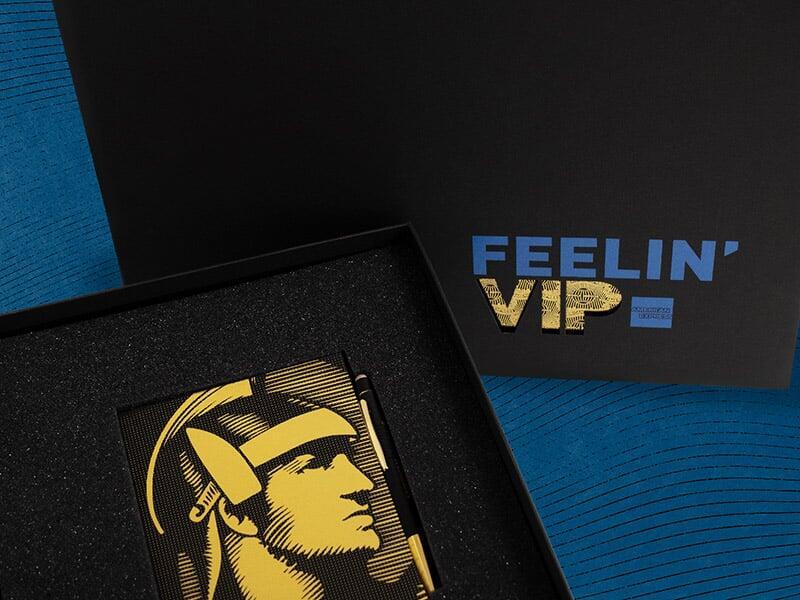
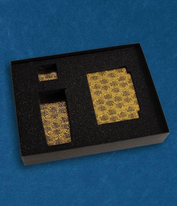
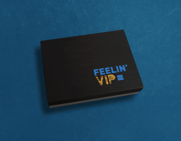
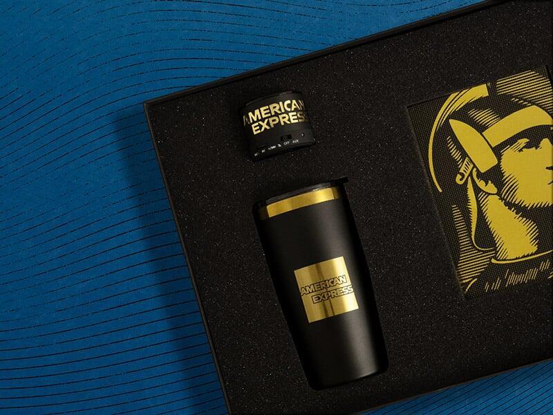
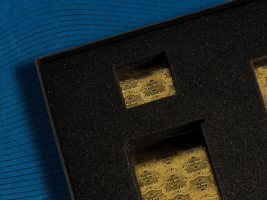
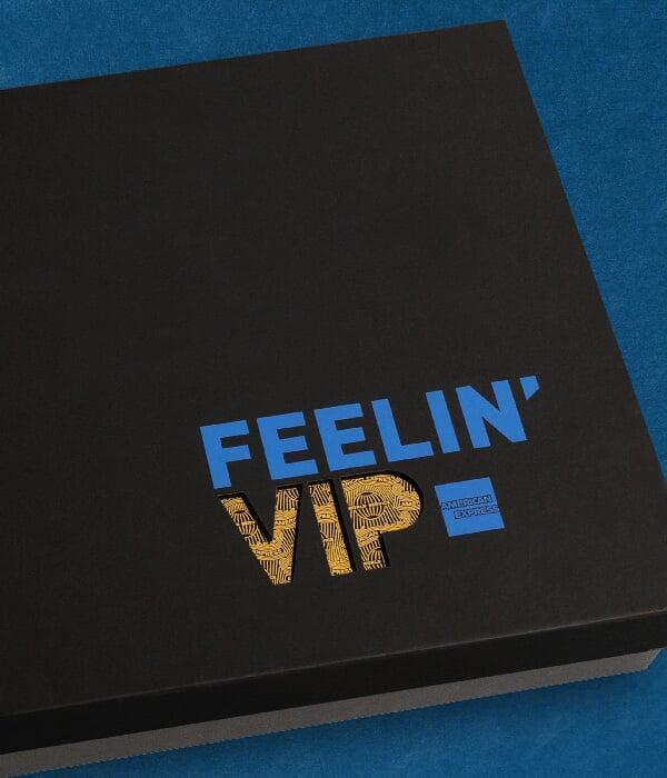
They started with the brand's existing iconic gold equity and pushed it past expected. A die-cut lid spelling out "AMEXtravagant" sits over a gold foil inlay, creating depth before you even open it. Inside, custom foam gave the centurion logo and brand pattern their own stage. Each element (tumbler, notebook, pen) got the same treatment: everyday utility elevated into something you'd actually want on your desk.
The trick was treating AMEX's own design language as the hero, not decoration.
Result:
New cardholders didn't just receive merch. They got a physical argument for why they made the right choice. The kit turned brand assets into tactile proof points.
Packaging isn't protection. It's the first chapter of the story you're asking someone to believe.