- Campaign Name: Limited-Edition Flavor Bottles
- Core Strategy: Mirror product innovation in branded gifting to reward influencers and superfans
Challenge:
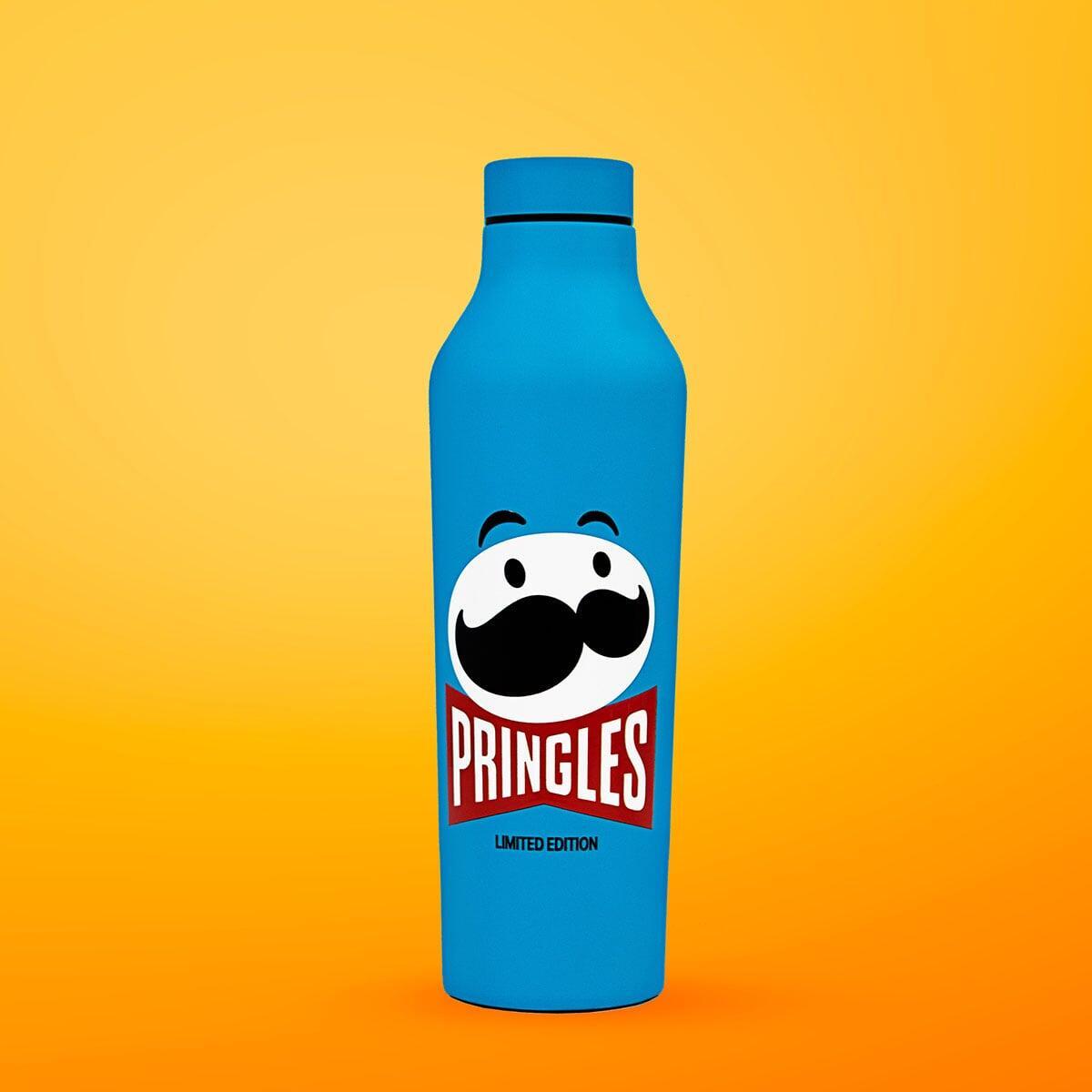
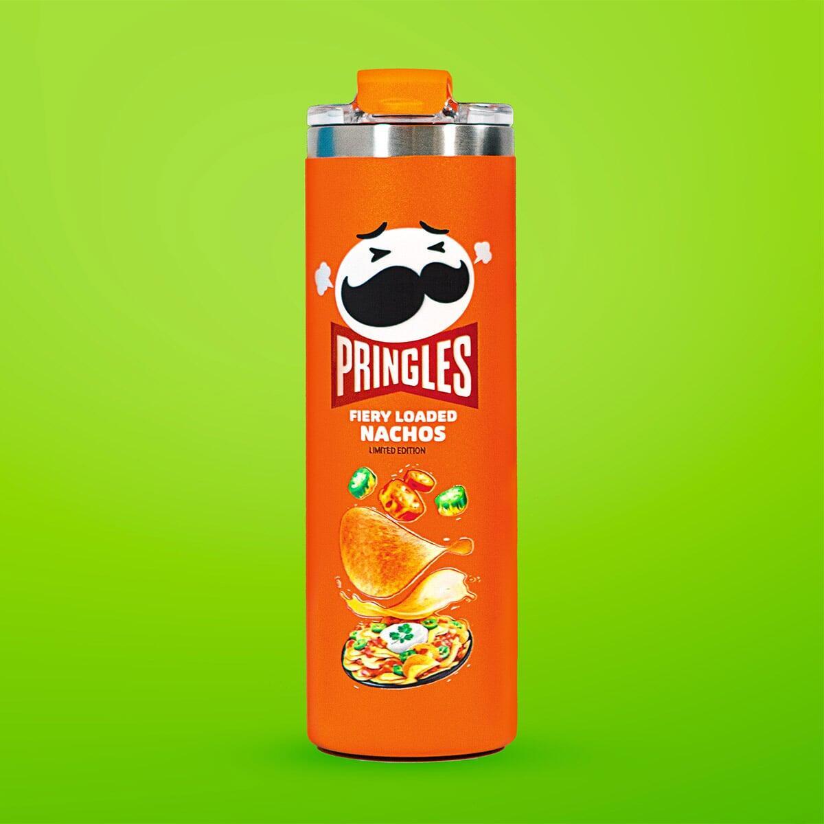
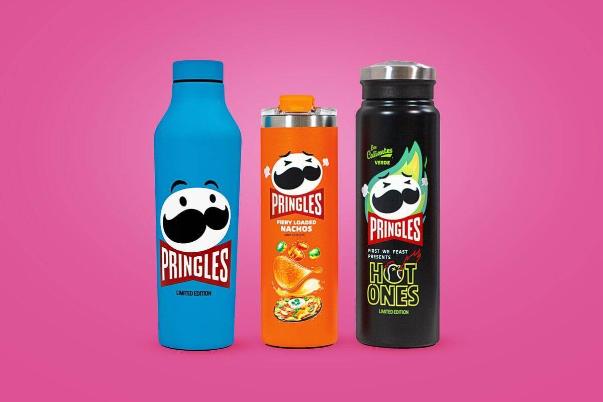
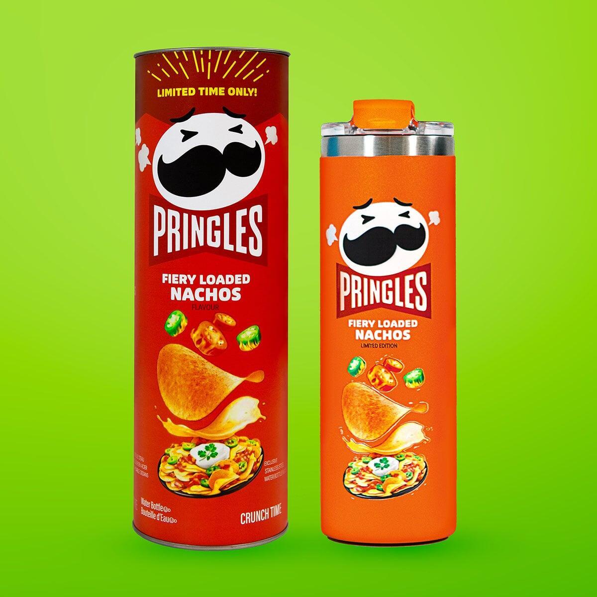
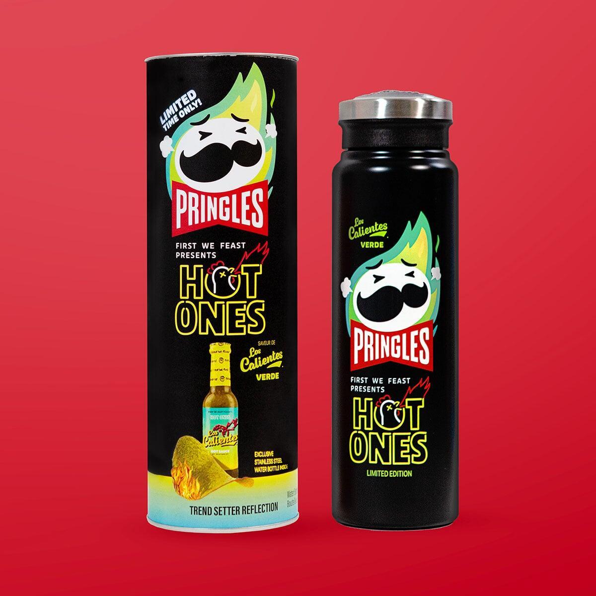
Pringles launched three limited-edition chip flavors. They needed a way to reward brand influencers and create buzz beyond the product itself.
Most brands default to generic merch that has nothing to do with what they actually make. A water bottle with a logo doesn't tell anyone why your product matters. The disconnect between what you sell and what you give away is a missed opportunity.
Response:
Pringles skipped the logo slap. They designed three custom bottles each matching a limited-edition flavor's branding. The packaging mirrored the chip tube. The visual language stayed consistent. The result: merch that felt like an extension of the product line, not an afterthought.
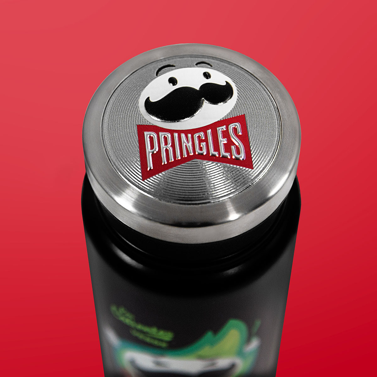
They used custom lids and fully branded tubes to hold the bottles, turning packaging into part of the experience.
Result:
The lesson isn't about printing techniques. It's about alignment. When your merch looks like it came from the same creative brief as your product, people recognize it instantly. It reinforces the campaign instead of diluting it.
If you're launching something limited or seasonal, ask: could your merch mirror it? Superfans will notice.